
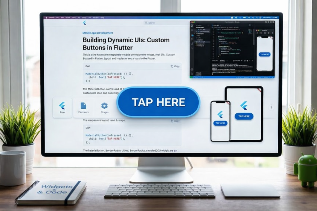
When developing mobile applications, a Button in Flutter is one of the most essential elements for user interaction. Buttons act as a bridge between the user and the application, allowing the user to tap, select, and perform actions seamlessly. In other words, without Button in Flutter, navigating an app or performing tasks would be cumbersome, and the overall user experience would suffer significantly.
Moreover, Flutter offers a wide range of buttons, each with its unique appearance, behavior, and purpose. Some buttons are bold and visually prominent, while others are subtle and lightweight. This variety enables developers to design apps that are both functional and visually appealing. By understanding Button in Flutter, developers can create user interfaces that are not only interactive but also intuitive.
In addition, Flutter makes it easy to style buttons according to your app’s theme. Developers can change colors, shapes, elevation, padding, and even implement custom effects without difficulty. Therefore, mastering Button in Flutter is a crucial skill for building modern, polished, and user-friendly applications that stand out in today’s competitive app market.
What is a Button in Flutter?
A Button in Flutter is a widget that allows users to perform actions when tapped. It is one of the most interactive elements in an app and can trigger a wide range of functionalities. For instance:
- Submitting a form
- Opening a new screen or page
- Saving or updating data
- Displaying messages, dialogs, or notifications
Every Button in Flutter relies on the onPressed function to respond to user interactions. If the onPressed property is not set, the button will remain inactive. This simple mechanism allows developers to easily integrate buttons into their apps while controlling how and when they respond to user actions.
In short, the Button in Flutter is a gateway to almost all interactive features of an app. Without proper buttons, users would struggle to navigate or engage with your app’s content efficiently.
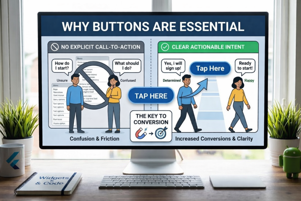
Why Buttons are Important
Buttons are more than just clickable elements; they are the core of user interaction. A well-placed Button in Flutter guides the user through the app and improves overall usability.
They make the app interactive by giving users control over actions
They act as guides to indicate what the user can do next
They enhance user experience by making navigation intuitive
Because of this, it is critical to choose the right type of Button in Flutter for each scenario. The wrong button can confuse users, reduce engagement, and negatively impact the app’s usability. Properly used buttons, however, can make the interface feel responsive, modern, and user-friendly.
Types of Button in Flutter
Flutter provides several types of buttons, each designed for a specific use case. Understanding their differences is key to designing effective interfaces.
1. Text Button
The Text Button is the simplest form of Button in Flutter. It contains only text without a background or border.
TextButton(
onPressed: () {},
child: Text(“Click Me”),
)
Features:
- No background, lightweight design
- Ideal for secondary or subtle actions
Text Buttons are commonly used for actions like “Cancel,” “Learn More,” or other non-primary interactions where a bold appearance is not necessary. They are particularly useful when multiple buttons are placed in a single layout, and you want to avoid visual clutter.
2. Elevated Button
The Elevated Button is one of the most commonly used Button in Flutter types. It has a shadow and a raised appearance, making it more noticeable.
ElevatedButton(
onPressed: () {},
child: Text(“Submit”),
)
Features:
- Prominent and visually noticeable
- Ideal for main actions like “Submit,” “Save,” or “Login.”
Elevated Buttons are perfect when you want to draw user attention to a key action. Developers can further enhance their visual appeal by customizing colors, elevation, and shape using ButtonStyle or the styleFrom method.
3. Outlined Button
The Outlined Button has a border around it but no filled background. It is often used as a secondary action button.
OutlinedButton(
onPressed: () {},
child: Text(“Cancel”),
)
Features:
- Clear border outline without background fill
- Suitable for secondary or optional actions
Outlined Buttons work well in forms or modal dialogs where you want users to notice the primary action first (Elevated Button) while still providing a visible secondary option.
4. Icon Button
The Icon Button is a Button in Flutter that shows only an icon. It is commonly used for quick actions or toolbar buttons.
IconButton(
icon: Icon(Icons.favorite),
onPressed: () {},
)
Features:
- Minimalistic, only icon-based
- Perfect for quick actions like “Like,” “Share,” or “Bookmark.”
Icon Buttons enhance app navigation while keeping the interface clean, especially in toolbars and app bars where space is limited.
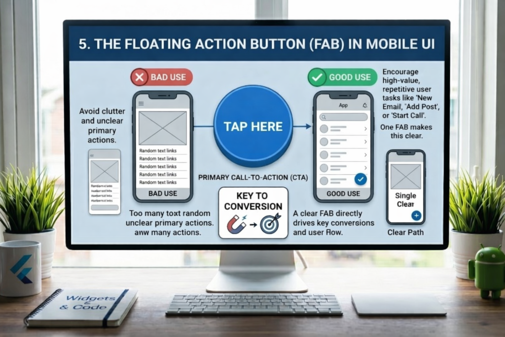
5. Floating Action Button
The Floating Action Button (FAB) is a circular button that floats above the content. It usually represents a primary action.
FloatingActionButton(
onPressed: () {},
child: Icon(Icons.add),
)
Features:
- Circular and floating design
- Draws immediate attention to key actions
- Typically used for adding new items, creating content, or initiating important workflows.
FABs are widely used in apps like messaging, social media, and productivity tools to encourage primary actions.
6. Dropdown Button
The Dropdown Button shows a list of options when tapped. It allows the user to select one value from multiple choices.
DropdownButton(
value: “One”,
items: [“One”, “Two”]
.map((e) => DropdownMenuItem(
value: e,
child: Text(e),
))
.toList(),
onChanged: (val) {},
)
Features:
- Ideal for forms and selections
- Saves space by displaying options only when needed
Dropdown Buttons improve usability when the user needs to select from a list without overwhelming the interface.
7. Popup Menu Button
The Popup Menu Button shows additional options in a dropdown or pop-up menu.
PopupMenuButton(
itemBuilder: (context) => [
PopupMenuItem(child: Text(“Option 1”)),
PopupMenuItem(child: Text(“Option 2”)),
],
)
Features:
- Suitable for extra actions or less frequently used options
- Commonly used in app bars and toolbars.
Popup menus help keep the interface clean while still giving users access to multiple options.
Understanding ButtonStyle in Flutter
The design and behavior of a Button in Flutter can be fully customized using ButtonStyle. This allows developers to define:
- Colors (background, foreground, overlay)
- Shape and border
- Elevation and shadow
- Padding and siz
- Icon properties
By customizing ButtonStyle, you can create buttons that match your app’s theme, brand colors, or unique design requirements. Flutter also provides styleFrom() methods for simpler styling, especially for common modifications like background color, padding, and text color.
Example: ButtonStyle Usage
ElevatedButton(
style: ButtonStyle(
backgroundColor: WidgetStatePropertyAll(Colors.green),
),
onPressed: () {},
child: Text(“Styled Button”),
)
This sets a green background for all states of the button, making it consistent with your app theme.
Button States
A Button in Flutter can have different states that determine its behavior and appearance:
- Pressed
- Hovered
- Focused
- Disabled
Flutter handles these states using Widget State Property, which allows developers to define styles for each state individually. For example, you can make a button change color when pressed while keeping other states consistent.
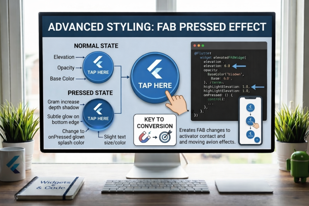
Advanced Styling: Pressed Effect
ElevatedButton(
style: ButtonStyle(
backgroundColor: WidgetStateProperty.resolveWith((states) {
if (states.contains(WidgetState.pressed)) {
return Colors.red;
}
return Colors. blue;
}),
),
onPressed: () {},
child: Text(“Press Me”),
)
This makes the button turn red when pressed and blue otherwise, creating an interactive experience.
Easy Styling with styleFrom()
Instead of manually defining all states, you can use styleFrom() for quick styling:
ElevatedButton(
style: ElevatedButton.styleFrom(
backgroundColor: Colors.green,
padding: EdgeInsets.all(15),
),
onPressed: () {},
child: Text(“Easy Style”),
)
This is perfect for most cases and reduces code complexity while keeping the Button in Flutter attractive and functional.
Global Button Theme
You can apply a consistent style across all buttons in your app:
MaterialApp(
theme: ThemeData(
textButtonTheme: TextButtonThemeData(
style: TextButton.styleFrom(
foregroundColor: Colors.green,
),
),
),
)
This ensures all Text Buttons follow the same color and style, enhancing visual consistency.
Material 3 Buttons
Flutter supports modern Material Design 3 buttons, including:
- ElevatedButton
- FilledButton
- FilledButton.tonal
- OutlinedButton
- TextButton
Using Material 3 buttons gives your app a modern, cohesive, and professional look, improving the overall user experience.
Common Mistakes
Using deprecated buttons like RaisedButton Not implementing onPressed Poor color contrast or mismatched design Avoiding these mistakes ensures that your Button in Flutter is fully functional and visually appealing
Best Practices
- Always use the correct button type for its purpose
- Keep design simple and intuitive
- Combine text and icons for better clarity
- Maintain consistent styles across the app
Conclusion
In conclusion, the Button in Flutter is an essential widget for app development. It enables interaction, improves usability, and allows developers to design visually attractive and functional apps. Flutter provides a variety of button types and styling options, making it easy to implement buttons that match your app’s theme.
Additionally, mastering ButtonStyle and understanding different button states allows developers to create fully customized buttons. By following best practices and leveraging Flutter’s powerful button system, you can create apps that are not only functional but also engaging and user-friendly.
FAQs
1. What is a Button in Flutter?
Button in Flutter is a widget that allows users to perform actions like tapping, submitting forms, or navigating screens. It works through the onPressed function.
2. How many types of Button in Flutter are there?
There are several types, including TextButton, ElevatedButton, OutlinedButton, IconButton, FloatingActionButton, DropdownButton, and PopupMenuButton. Each is used for specific purposes.
3. What is ButtonStyle in Flutter?
ButtonStyle allows full customization of a Button in Flutter. You can change colors, shape, size, padding, icon properties, and behavior in different states.
4. Difference between ElevatedButton and TextButton?
ElevatedButton has a raised background with a shadow, making it noticeable. TextButton is simple, lightweight, and has no background, ideal for minor actions.
5. Which button should I use in Flutter?
- ElevatedButton → Main actions
- TextButton → Secondary actions
- FloatingActionButton → Primary or important tasks
Meta Description
Learn all types of Button in Flutter with this complete tutorial. Explore TextButton, ElevatedButton, IconButton, FloatingActionButton, ButtonStyle, styling, and best practices to create modern and interactive Flutter apps.