

Checking a website’s mobile friendliness is very important today. Most people use their mobile phones to browse the internet, search for information, and shop online. Because of this, every website needs to work well on mobile devices. A mobile-friendly website is easy to use, loads fast, and looks clean on small screens. It also helps your website rank better on search engines, because they now focus on mobile-first indexing.
If your website is not mobile-friendly, users may leave your site very quickly. This can happen if your website is slow, hard to read, or difficult to use on a phone. When users leave, you lose traffic and potential customers.
That is why it is important to make sure your website works properly on mobile. In this guide, you will learn simple ways to test your website. You will also learn how to fix problems and improve your website for mobile users in 2026.
Table of Contents
- What is Mobile Friendliness
- Why Mobile-Friendly Websites Matter
- Key Elements of a Mobile-Friendly Website
- Best Tools to Check Mobile Friendliness
- Step-by-Step Guide to Test Your Website
- Common Issues Found in Mobile Testing
- How to Fix Mobile Friendliness Problems
- Advanced Tips for Better Optimization
- Mistakes to Avoid
- FAQs
- Conclusion
1. What is Mobile Friendliness?
Mobile friendliness means how well a website works when someone opens it on a mobile phone or tablet. A mobile-friendly website automatically adjusts its layout according to the screen size. This allows users to read content easily, navigate smoothly, and interact with different elements without any difficulty. When a website is properly optimized, users do not need to zoom in to read text or scroll sideways to see content. Everything fits perfectly on the screen, making the browsing experience simple and comfortable. In short, mobile friendliness is about making your website easy to use on smaller screens.
2. Why Mobile-Friendly Websites Matter
Mobile-friendly websites are important because most people use their phones to go online. If your website does not work well on mobile, people may leave very quickly and may not come back again. This can reduce your website traffic and user activity.
Search engines also like mobile-friendly websites. If your site works well on mobile, it can rank higher in search results. This means more people can find your website. When users have a good and smooth experience, they trust your website more. This can help you get more sales, sign-ups, or visitors.
3. Key Elements of a Mobile-Friendly Website
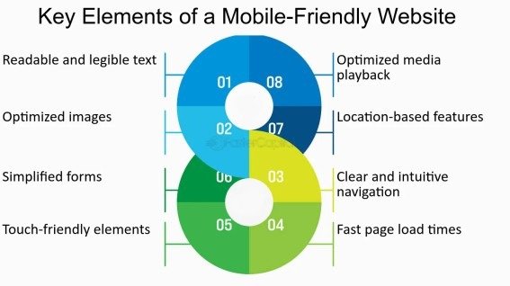
A good mobile-friendly website has some important features that make it easy to use. The design should change according to screen size so it looks good on all devices. The website should load quickly because users do not like waiting.
The text should be easy to read without zooming, and images should load fast and fit properly on the screen. Buttons and links should be big enough so users can tap them easily without mistakes. When all these things are done right, the website becomes simple, clean, and user-friendly.
4. Best Tools to Check Mobile Friendliness
There are many tools that can help you check if your website works well on mobile. One popular tool is Google Mobile-Friendly Test. It quickly checks your website and tells you if there are any problems.
Another helpful tool is Google Lighthouse. It gives more details about your website, like speed and performance. You can also use tools that show how your website looks on different screen sizes.
Some tools even let you test your website on real mobile devices. This helps you understand how users see your website. Using these tools again and again helps you keep your website updated and working well.
5. Step-by-Step Guide to Test Your Website
Checking your website on mobile is a simple process. First, open a testing tool and enter your website link (URL). After running the test, you will see a report that tells you if your website is working well on mobile or if there are any problems.
Next, carefully read the results and look for any issues mentioned in the report. These may include small text, slow loading speed, or layout problems. After that, it is also a good idea to open your website on different mobile phones to see how it looks in real use.
Finally, once you fix the issues, test your website again. This helps you make sure everything is working properly and your site is fully mobile-friendly.
6. Common Issues Found in Mobile Testing
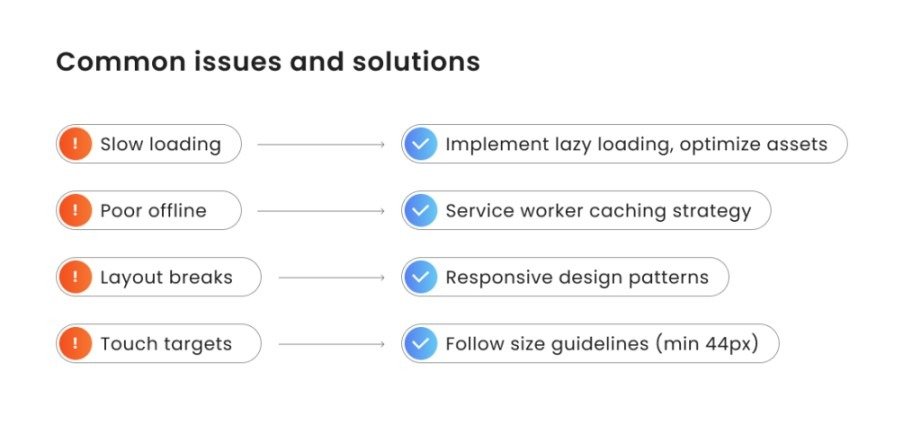
When you test a website, you may notice some common problems. One of the most common issues is slow loading speed, which can make users leave your site quickly. Another issue is when the design does not adjust properly to different screen sizes.
Sometimes the text appears too small, making it hard to read. Images may also not fit the screen correctly, which can affect the layout. Buttons that are too close to each other can cause users to click the wrong one by mistake.
These problems may look small, but they can create a poor user experience and reduce the performance of your website on mobile devices.
7. How to Fix Mobile Friendliness Problems
Fixing mobile problems is not hard if you follow some simple steps. First, use a responsive design so your website can fit all screen sizes automatically. This means your website will look good on phones, tablets, and other devices.
You should also make your images smaller so they load faster. Large images can slow down your website, so reducing their size helps improve speed.
Speed is very important for mobile users. Try to remove extra or unused code and use caching if available. Make sure your text is clear and easy to read without zooming. Also, keep enough space between buttons so users can tap them easily without clicking the wrong one.
These small changes can make your website faster, cleaner, and easier to use on mobile devices.
8. Advanced Tips for Better Optimization
If you want your website to work even better, you can follow some simple advanced ideas. A mobile-first design means you create your website mainly for mobile users first, then adjust it for bigger screens.
Lazy loading is another helpful method. It loads images only when users scroll down, which helps your website load faster. You should also avoid pop-ups because they can disturb users and make the website harder to use.
Keep your design simple and clean so users can easily find what they need. When your website is well organized, it becomes easier to use and also performs better in search engines.
9. Mistakes to Avoid
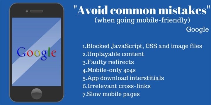
Many people make common mistakes that affect mobile performance. One big mistake is ignoring mobile users and focusing only on desktop design. Another mistake is using large images that slow down the website.
Some websites have complex layouts that are hard to navigate on small screens. Not testing the website regularly is also a problem, as updates may create new issues. Avoiding these mistakes will help you keep your website smooth, fast, and user-friendly on mobile devices.
Conclusion
Making your website mobile-friendly is very important in 2026 because most people use their phones to browse the internet. A mobile-friendly website is easy to use, loads fast, and looks good on small screens, which helps users stay longer and have a better experience.
By regularly checking your website and fixing any issues, you can improve performance and user satisfaction. This can also increase engagement, help your site rank better in search results, and support the long-term growth of your website.
FAQs
1. How can I check if my website is mobile-friendly?
You can use online tools like Google Mobile-Friendly Test or check your website manually on different devices.
2. Does mobile friendliness improve SEO?
Yes, mobile-friendly websites rank better because search engines focus on mobile-first indexing.
3. Can I make my website mobile-friendly without coding?
Yes, you can use website builders or responsive themes to easily optimize your site.
4. What is a good loading speed for mobile websites?
A good mobile website should load within two to three seconds.
5. How often should I test my website?
You should test your website regularly, especially after making changes or updates.
Meta Description
Learn how to check the mobile friendliness of a website in 2026 with this complete guide. Discover simple tools, tips, and methods to improve SEO and user experience.